Components
- Animated Drop List
- Animated Slider
- Animated Text
- Basic Header
- Big Grid
- Call to Action
- Cards Slider
- Certs Spec Cards
- Confirmation Page
- Content Grid
- Form Select
- Franchise Hero
- Glossary
- Image Content Cards
- Image Grid
- Industries Cards
- large alternating content
- Left Right
- Link Grid
- LR Accordion
- LR List
- Offset One Column
- Offset Two Column
- Overlapping Cards
- Pinned Left Right
- Pop Up Video
- Preview Accordion
- Process Slider
- Product Cards Grid
- Products Slider
- Scrolling Left Right
- service cards
- Tabbed FAQs
- Tabbed Link Grid
- Tabbed Wysiwygs
- Team Grid
- Two Column List
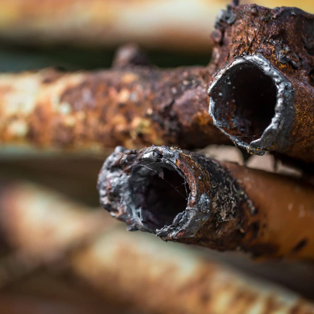
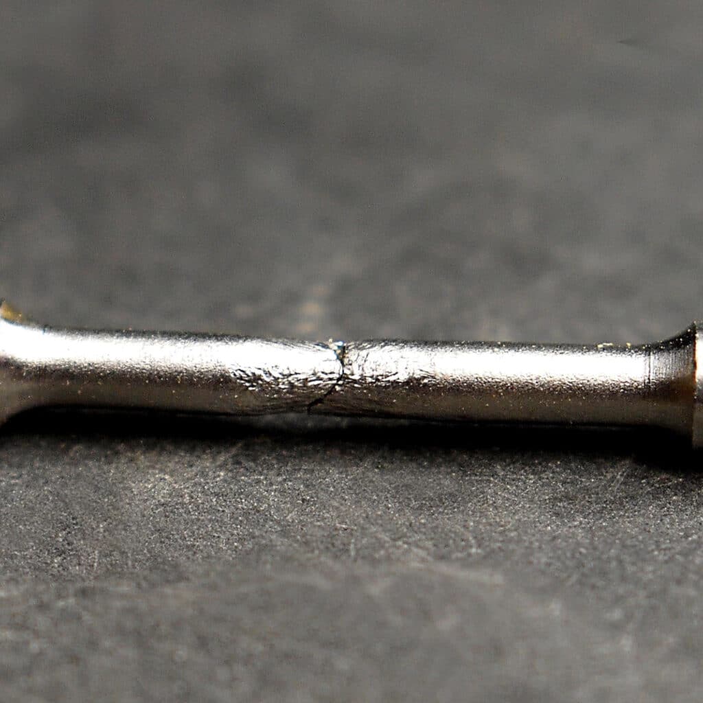
How Metals Fail
Some of the most common metal failures include:
Armoloy’s different metal coating solutions help industries avoid costly metal failures and unplanned downtime.


Cards Slider
The description of your component goes here, or any notes you might have about it.
| Label | Name | Type | Notes |
|---|---|---|---|
| Heading | cards_slider_heading | group | (Clone of Utility : Heading) |
| Button Link | cards_slider_button | link | |
| Left Content | cards_slider_left_content | wysiwyg | |
| Right Content | cards_slider_right_content | wysiwyg | |
| Slider Cards | cards_slider_slider_cards | repeater |
If more than three cards are added, the component will be a slider with a progress bar at the bottom.